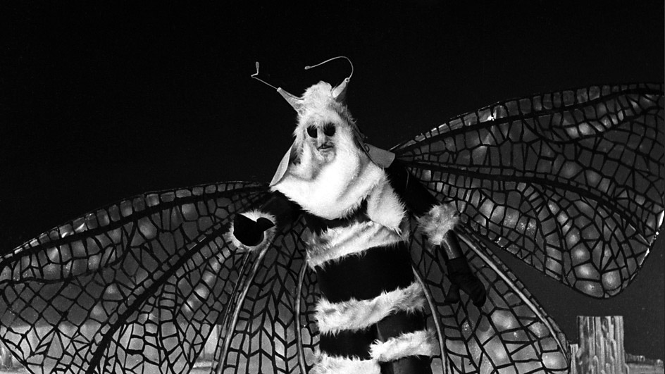
Loyal Tour denizens will have noticed a certain chrysalis for the front-end of the Tour. Not to be confused with the those beautiful butterflies from The Web Planet, but the Tour has emerged with a somewhat slicker, more responsive interface than ever.
Particular attention has been paid to the Doctor tabular index pages which have been cleaned and become more useful in ‘dark mode.’ A number of typography and navigational notions have also been folded-in to enhance the overall ambience.
Or of course you can just get after the images, just like always.


